Les menus sont bien plus qu'une simple liste de plats ; ils constituent un canevas stratégique où la couleur influence la façon dont les clients perçoivent votre marque, oriente leurs choix et les incite même à dépenser. Si votre palette se résume toujours à « ce qui est beau », il est temps de vous tourner vers un design axé sur la psychologie.
Pourquoi le rouge stimule l'appétit (et les ventes)
Commençons par le rouge, la couleur qui provoque le plus la faim. Le rouge augmente le rythme cardiaque, augmente les impulsions nerveuses et augmente les niveaux d'énergie. Il met littéralement le corps en état de préparation, ce qui en fait le coup de pouce psychologique idéal pour tous ceux qui envisagent un deuxième verre ou un apéritif impulsif.
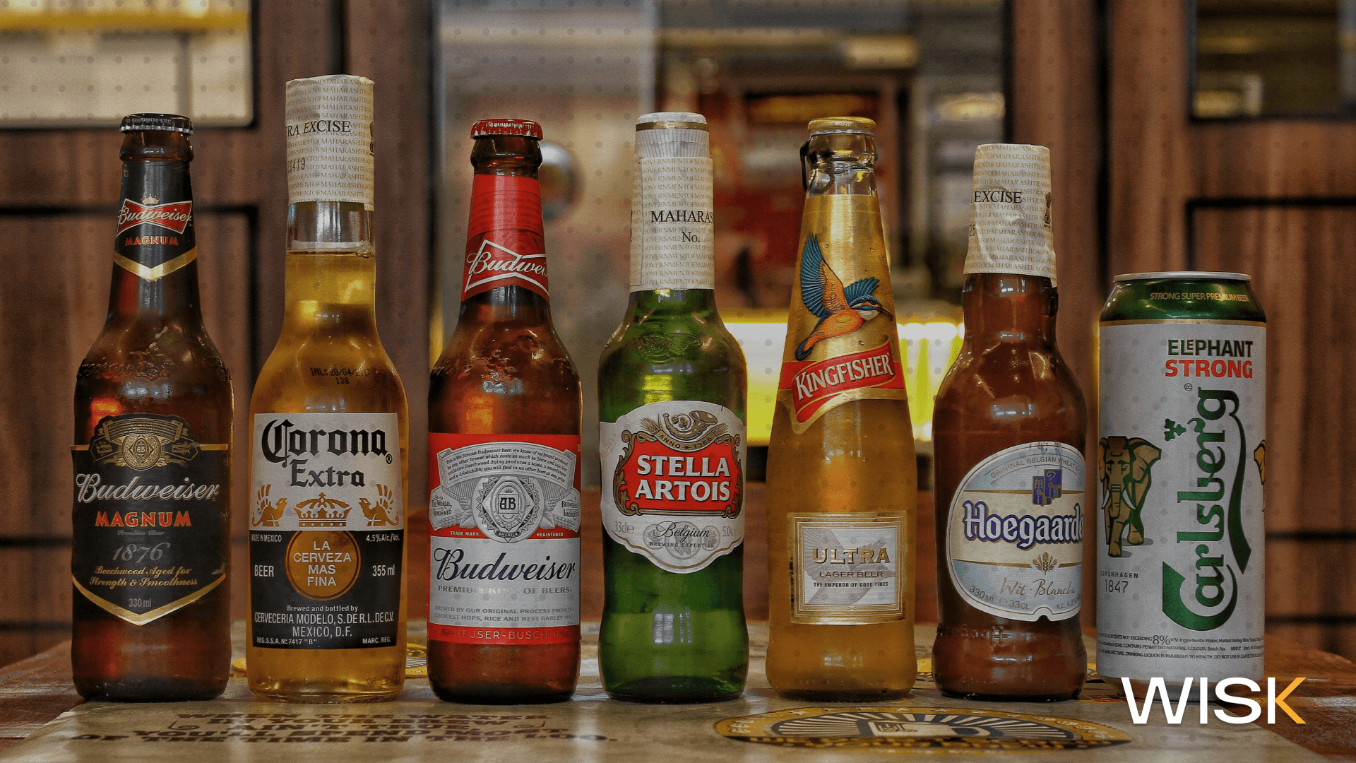
Vous remarquerez des éclaboussures rouges sur les restaurants de restauration rapide tels que McDonald's, Burger King et KFC. Ce n'est pas un hasard. Dans l'industrie de la restauration rapide, le rouge est utilisé pour stimuler l'appétit, attirer l'attention et encourager des décisions rapides. En d'autres termes, la couleur n'est pas qu'une question de marque, elle concerne les sciences du comportement.
Les couleurs chaudes et pourquoi elles fonctionnent
Les couleurs chaudes comme l'orange, le rouge et le jaune permettent aux gens de se sentir à l'aise, les bienvenus et prêts à manger. Les aliments à base d'orange comme les patates douces ou la soupe à la citrouille sont déjà copieux et sains. Ces couleurs, lorsqu'elles sont utilisées dans les menus ou les murs, peuvent évoquer le bonheur, l'énergie et une sensation de bien-être.
Le jaune bonheur est souvent associé à des rouges ou à des oranges pour donner une touche de vie à un espace ou à un menu, sans être écrasant. Ces tons sont parfaits pour les repas décontractés, les brunchs, les cafés et les bistrots qui cherchent à stimuler l'énergie et à donner vie à l'endroit.
L'étrange cas du bleu : le suppresseur naturel de l'appétit
Alors que les tons chauds réveillent votre appétit, la couleur bleue a tendance à le supprimer. Les aliments bleus sont rares dans la nature, c'est pourquoi nous les traitons instinctivement avec prudence. Pensez-y : à quelle fréquence voyez-vous du bleu dans une assiette, à part des myrtilles ou du fromage bleu ?
Dans le marketing alimentaire, la couleur bleue est délicate. Il est souvent utilisé dans l'emballage de produits alimentaires naturels ou de marques respectueuses de l'environnement, car il est synonyme de simplicité et de confiance. Mais trop de bleu sur un menu ou dans l'éclairage peut rendre les plats moins attrayants. Si vous recherchez une ambiance gastronomique ou une atmosphère chic, utilisez-le avec parcimonie et associez-le à des tons terreux ou à des couleurs vives pour créer un contraste.
Passer au vert : le respect de l'environnement rencontre la fraîcheur
Le vert est la couleur de l'affiche pour les aliments frais, les ingrédients sains et tout ce qui est naturel. Il indique à vos clients : « C'est bon pour votre corps et pour la planète ». Dans le monde de la psychologie des aliments et des couleurs, le vert est associé au respect de l'environnement, aux aliments naturels et au bien-être.
Mais le vert doit être utilisé avec précaution. Si vous optez pour une lumière trop vive, cela peut paraître artificiel. Si vous faites trop sombre, vous risquez d'avoir froid. La conception réussie d'un restaurant utilise le vert pour soutenir les thèmes de la durabilité, de l'alimentation saine ou des ingrédients naturels. Il est parfait pour les restaurants végétaliens, les cafés biologiques ou les restaurants mettant en valeur les produits locaux.

Psychologie des aliments et des couleurs : pourquoi nous mangeons d'abord avec nos yeux
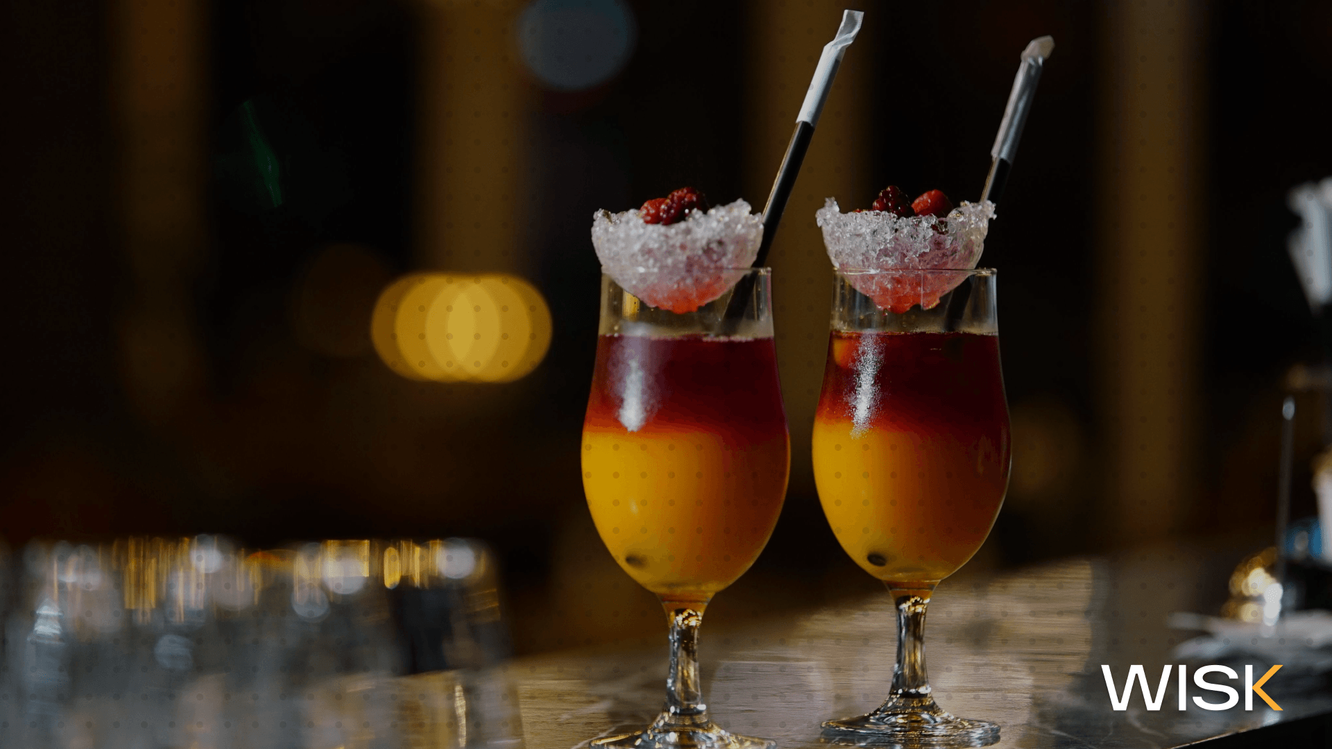
La psychologie des aliments et des couleurs n'est pas une question de tendances, mais de perception. La couleur prépare le terrain avant même que la première bouchée ne soit prise. Notre cerveau associe les couleurs aux saveurs, à la santé et même à la taille des portions. C'est pourquoi un cocktail vert fluo crie « acide et artificiel », tandis qu'une étiquette d'huile d'olive en sourdine indique « naturelle et de qualité supérieure ».
Les couleurs affectent l'appétit, l'humeur et la mémoire. Dans le monde de la restauration, ces signaux psychologiques peuvent faire pencher la balance, qu'il s'agisse d'hésiter à « commandons-en une de plus ».
Marketing alimentaire : bien plus que de délicieuses photos
Si votre restaurant investit dans le marketing alimentaire, ignorer la théorie des couleurs revient à laisser de l'argent sur la table. Qu'il s'agisse de publications sur les réseaux sociaux ou de mises en page de menu, chaque élément visuel doit correspondre au profil aromatique de votre marque. La couleur ne représente pas seulement votre nourriture ; elle l'amplifie.
Dans les espaces compétitifs, la bonne palette de couleurs permet d'attirer l'attention, de renforcer la notoriété de la marque et d'orienter subtilement les clients vers les articles à forte marge bénéficiaire. Même l'emballage des produits joue un rôle à cet égard : pensez au jus d'orange orné de motifs en forme de soleil ou à des aliments naturels emballés dans des teintes douces et terreuses.
Comment la couleur affecte l'appétit (et ce que cela signifie pour les ventes)
Les différentes couleurs déclenchent différentes réactions physiques et émotionnelles. Le rouge et l'orange augmentent l'appétit, tandis que le bleu et le violet ont tendance à le supprimer. Le vert indique la santé. Brown évoque le confort et l'aspect terreux.
Les choix de couleurs de vos menus et de votre décoration peuvent inciter les clients à commander plus, à rester plus longtemps ou à revenir. Plus vous adaptez le design de votre restaurant à l'influence de la couleur sur l'appétit, plus vous contrôlez l'expérience culinaire.
Psychologie des couleurs dans la conception de restaurants
Ce n'est pas pour rien que la psychologie des couleurs est au cœur de l'image de marque d'intérieur. Dans la conception des restaurants, la couleur influe sur l'humeur, la rotation des tables et la perception de la qualité des aliments. Vous voulez faire le plein d'énergie ? Optez pour les rouges et les jaunes. Un rythme plus lent et haut de gamme ? Pensez aux noirs, aux bruns et à un éclairage tamisé.
Lorsque vos visuels reflètent le goût et l'expérience de votre menu, les clients ne se contentent pas de le remarquer. Ils s'en souviennent.
Earth Tones : le secret de l'attrait biologique
Les tons de terre prennent un moment, et pour cause. Des bruns argileux aux verts moussus, ces couleurs relient les convives à la nature et aux ingrédients naturels. Ils sont parfaits pour les restaurants qui souhaitent mettre l'accent sur la durabilité, le patrimoine ou les techniques artisanales.
L'utilisation de teintes terreuses sur les fonds de menu, les murs ou les uniformes renforce le message suivant : « Nous servons des plats authentiques et honnêtes ».
Connaissez votre public cible avant de choisir une palette
Les couleurs qui conviennent à un bar à smoothies ne conviendront pas à un salon à whisky. La définition de votre public cible est la première étape de la création d'un menu qui lui parle.
Sont-ils des milléniaux axés sur la santé ? Des familles ? Des rendez-vous haut de gamme ? Plus votre démographie est définie, plus vos décisions en matière de couleurs deviennent efficaces. Le choix des couleurs en fonction de votre public contribue à tout influencer, de la perception des prix à la résonance émotionnelle.
Choisir des couleurs qui correspondent à votre marque (et à vos marges)
Choisir les couleurs, c'est bien plus que faire correspondre votre logo. Il s'agit de lier la nourriture, le style de service et l'expérience. Vous souhaitez mettre en avant des articles haut de gamme ? Utilisez des teintes riches et profondes. Mettez en avant les bouchées rapides ? Utilisez des couleurs énergisantes.
La couleur peut être un indicateur de prix, de qualité et de confiance. Lorsqu'il est utilisé correctement, il oriente les clients vers les articles de grande valeur sans qu'un seul mot ne soit prononcé.
L'avenir de la psychologie des menus (et comment WISK.ai peut y contribuer)
Voici le deal : la couleur ne va pas disparaître. En fait, cela devient de plus en plus essentiel à mesure que l'expérience client s'affine. Les gens ne se contentent pas de manger. Ils prennent des photos. Ils partagent. Ils se comparent. Et chaque détail, y compris la couleur, compte.
C'est là WISK.ai entre en ligne de compte. Nous aidons les restaurants à prendre des décisions fondées sur des données, de l'inventaire à l'ingénierie des menus. Vous voulez voir quels articles de menu se vendent ? Quelles boissons sont consommées le plus rapidement à certains moments ? WISK vous donne cette idée. Ainsi, lorsque vous décidez d'attribuer un code couleur à une carte des vins ou de mettre en avant un nouvel apéritif, il ne s'agit pas d'une supposition, mais d'une stratégie.
Les menus ne sont pas que visuels. Ils sont émotionnels, financiers et psychologiques. Et lorsqu'ils sont conçus en tenant compte de la couleur, ils peuvent améliorer considérablement vos résultats.
Êtes-vous prêt à concevoir des menus plus intelligents et à exécuter une opération plus précise ?
Essayez WISK.ai dès aujourd'hui et découvrez comment des informations intelligentes peuvent transformer des choix de conception en bénéfices. Laissez vos couleurs agir aussi bien que votre cuisine.